Hello space enthusiasts, and welcome back to The Ecosmic Compiler.
I’m Serena Tempesta, the Graphic Designer & Art Director behind Ecosmic's recent rebrand. The last issue explored the evolving European space regulations shaping orbital sustainability. For this August newsletter, we’re turning the telescope inwards to a somewhat lighter topic, something that doesn’t involve satellites but still has everything to do with mission success: Ecosmic’s visual identity.
A brand for the mission, not just the moment
When Ecosmic launched, the old logo put the company on the space industry map. But as the mission grew sharper, the tech more advanced, and the team more international, it was time for a brand that could keep pace. One that whispered this company is at the intersection of space & software.

Why the change?
- Making software visible (literally).
The space part of “Ecosmic” is obvious. But the brains behind it? Pure software engineering. That’s why the logo’s font is Roboto Mono: a monospaced typeface used in programming: it’s the visual equivalent of clean, elegant code (no wasted pixels, no visual bugs). - Minimalist, but not boring.
In space, clutter is dangerous. Same for design. We stripped the visuals down to the essentials: geometric, balanced, and clean. So the message comes through crystal clear. - Lower-case, higher-vibes.
Most space brands go ALL CAPS, mission-control style. Ecosmic? Lowercase. Chill. The friend that can explain orbital mechanics to you over coffee. - The forward symbol > in the logo is not just a design flourish. It is a visual cue for progress and momentum, a nod to the forward-looking nature of both the technology and the mission.

Speaking in color
- White smoke & black:
clarity and contrast for effortless readability. - Neon blue:
bold, optimistic, with a touch of sci-fi glow. - Lime:
the spark of energy you don’t see coming. - Silver:
the calm in the background.
Beyond colours and type
A great brand identity is more than just colours and typography. It is a system that everyone inside and outside the company can use to communicate the soul of the brand. Once defined, it becomes the foundation for every other creative layer, guiding social media visuals, event materials, investor presentations, and even product interfaces.

And then there are the moments when a brand steps off the screen and into the real world. At a conference booth, it is in the roll-up you spot from across the hall, the printed brochure you flip through, the business card with a QR code you tuck into your pocket. These are the touchpoints you can actually hold, feel, and see in your everyday environment — the brand in its physical form.

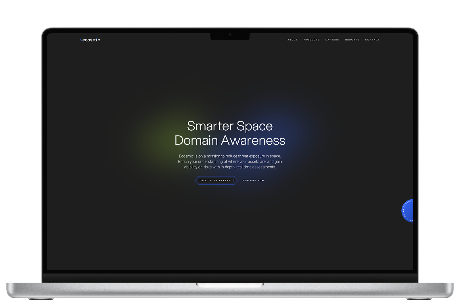
On the digital side, the same visual language lives in Ecosmic’s new website, designed by Calvin Lau. From showcasing the company’s journey to detailing the performance of its flagship product SAFE, the website acts as an entry point to the company. Curious minds, partners and clients can explore the products, vision and people that make Ecosmic what it is while never being more than one click awayfrom meeting an expert. It’s the living image of the company, dressed in the same visual identity as the rest of the Ecosmic brand.
Branding rules are universal
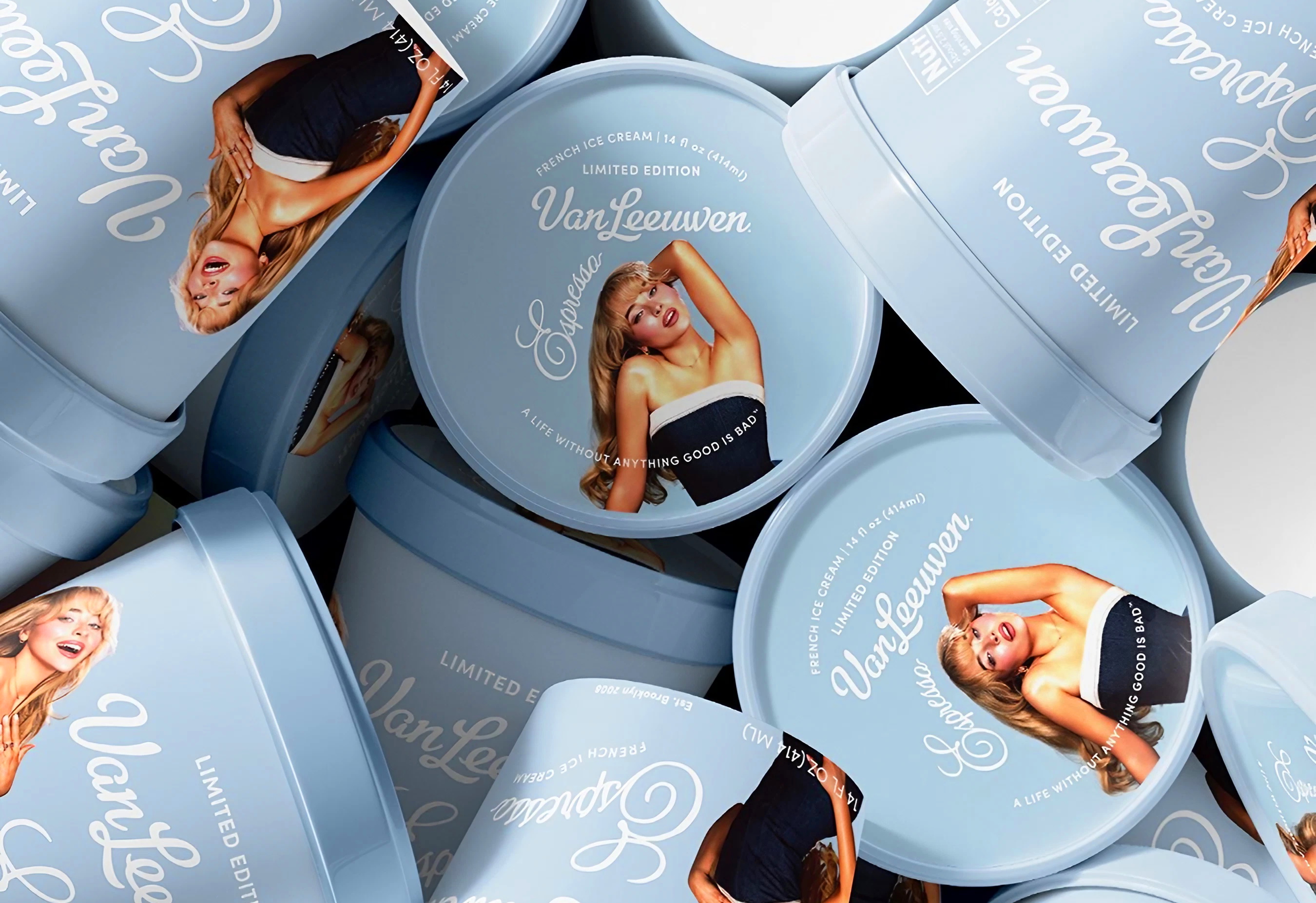
And if you think this only works in aerospace, let’s look at what happens in music and fashion… you guys know Sabrina Carpenter, right? Did you know she’s been in the industry since she was a kid, releasing albums for over a decade to general indifference? Then came a perfectly executed visual rebrand: among the brand guidelines, a palette dominated by the baby blue shade, appearing everywhere from her tour outfits to the red carpet carpets. It became the common thread in standout campaigns (from tour visuals to a baby blue Espresso ice cream collab).
It’s the same logic as a company aligning every channel: from pitch decks to offline assets, with precise, consistent visual guidelines.
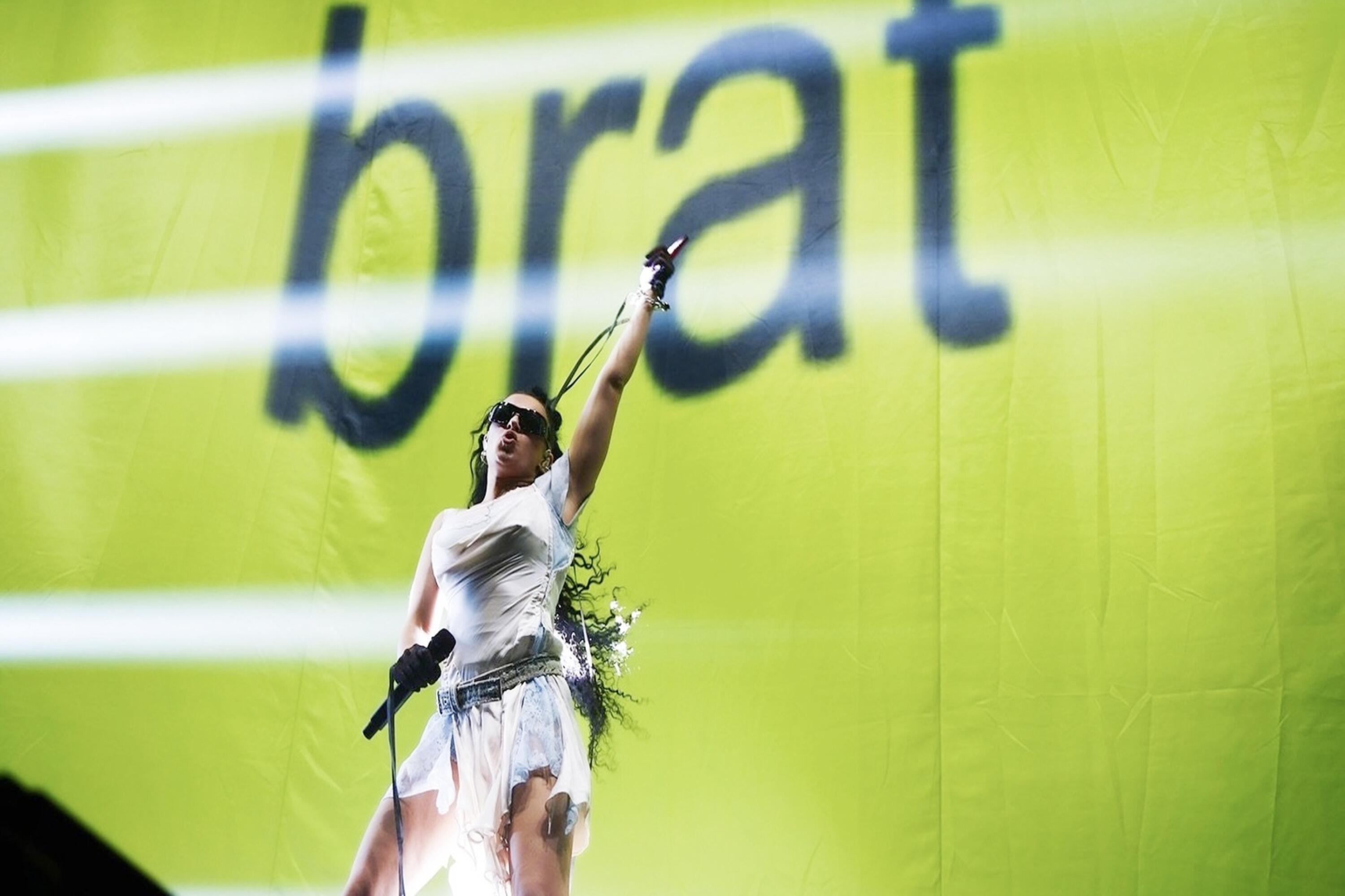
Charli xcx’s “Brat” album followed a similar playbook: simple but unmistakable visuals, turned into a marketing explosion. A wave of user-generated content, memes, and custom graphics did the work for them, proving that when your visuals are clear, your audience becomes your loudest amplifier.
Rebranding can dramatically change the way the public sees you. Now think of the Birkenstock “Boston”: once your uncle’s camping shoes, now the global radical-chic uniform. The shift wasn’t accidental: high-profile collaborations with Rick Owens and Valentino, plus a carefully crafted visual identity in campaigns and editorials, took them from the orthopedic aisle straight to Vogue covers and fashion week street style.
Rebrands don’t just change how a company looks, they change how you remember it. And trust me, you won’t forget Ecosmic.